
Forecastr
Year
2023 -2024
Contributions
User Research, Product Strategy, User Experience, Visual Improvements, Cross Functional Collaboration


Background
Forecastr is a B2B SaaS and Services finance app designed to assist founders in creating and managing their financial models in order to raise capital, and make smart and confident decisions about their business.
-
What Carta is for cap tables, Forecastr wants to be for financial models.
With Forcastr, customers are able to build their own financial model with the help of our Financial Analysts OR they can have the analysts build it completely. Thus making Forecastr a SaaS and Services company.
-
On the product team, my role was to simplify, enhance efficiency, and create a delightful user experience for both our internal team and external users.
The most complex parts of the app were the dashboard and data table, which were my main areas of focus.
I collaborated closely with the engineers to come up with ideas and share UX best practices, resulting in the creation of the Forecastr Design Manifesto.
I then turned these concepts into proposals to present to stakeholders.
Main Problem

Complexity, unintuitive, poor IA & UI, and making incorrect assumptions about users.
-
A feature called “the formula builder”, which is used to enter data into the data sheet so users can understand their business’s financial projections is the most complex and vital part of the app as those numbers support other features of the app.
-
Most experiences over time became a kitchen sink of complex controls, with complex jargon in its copywriting.
-
Many business owners, specifically those without a finance background, found it difficult to understand the app during their onboarding process.
-
Due to complexity, lack of in-app notifications, and unintuitive and lack-luster design. Many users didn't see the value of keeping the app after one year.
Compiled User Interviews & Surveys Data
I conducted 20 1:1 interviews with current users and 60 survey respondents. The collected data were from current users, churned users, and potential users that have no relationship to Forecastr.
In the legend, are the top themes that ran across the research of what the users prioritized in a finance app.
User Personas
Each persona type was created from my research and given names to categorize their behaviours. Though these personas are isolated, one user may have overlapping persona type characteristics.

-
JTBD:
- Ensure customers have a smooth white glove onboarding so they understand the app
- Explain the app clearly for easy comprehension of functionalities.
- Build and maintain customer’s personalized financial model(s) - for service customers
Wants:
- Would like to app to handle the heavy lifting of creating financial models
Pain Points:
- Simple repetitive tasks are requiring a lot of clicks which is slowing down their workflow
- In-app tasks are a lot to explain to onboarding customers which can cause customers to feel overwhelmed
-
JTBD:
- Create a financial model for strategic decision-making for their company
- Present accurate financial data confidently to investors and other stakeholders.
- Easily identify areas where the business needs improvement to achieve goals
Traits:
- Lack of time or inclination to learn finance deeply
- Would like to spend time in other areas of the business instead of finances
- The fear of sounding uninformed during a pitch or making mistakes in their financial model due to not having a finance background
Pain Points:
- The app is too advance for someone who doesn’t have a finance background
- Wish they had access to industry benchmark insights like “how much should I spend on restaurant equipment?"
-
JTBD:
- Create a financial model for strategic decision-making for their company.
- Present accurate financial data confidently to investors and other stakeholders.
- Identify areas for business improvement and fundraising
Traits:
- May have a financial background or have grown accustomed to building models
- Doesn't mind spending a significant amount of time (>2 hours a week) toward the company’s finances
Pain Points:
- Simple tasks are required many steps and clicks compared to Excel and Google Sheets
- Doesn’t know if the price point is worth the learning curve hassle and time consumption
-
JTBD:
- Needs to evaluate a company’s financials to make informed investment decisions
Traits:
- Wants to see the accurate financial materials of a company in simple plain language
- Fears not having the right information to trust in their investment decisions
Pain Points:
- The app doesn’t have an interactive dashboard for scenario analysis
Top Pain Points
Too complex/advance for the average user which creates a high churn rate typically after 1 year of use.
Too many roadblocks (modals, clicks, drop-downs) for simple tasks.
The learning curve is heavy, especially those who aren’t finance savvy.
The UI isn’t clean and consistent.
The customers (small business owners) lean heavily on the analysts to help them build a model which interferes with scalability.
Finance jargon that is used inconsistently throughout the app.

“Love the concept of the app and the analysts but we are going back to using Excel as it seems easier for our team create and update our models”
“I see the value in the app, but Excel is free and I’m already used to it”
“The app is made for finance people and not regular people. I do love the analysts and appreciate their help”
“Our company is strapped for cash and we’d prefer to use our funds for other areas of the business”
“The user experience could be improved compared to the boundlessness of Excel and Google Sheets”
Designing the Data Table.
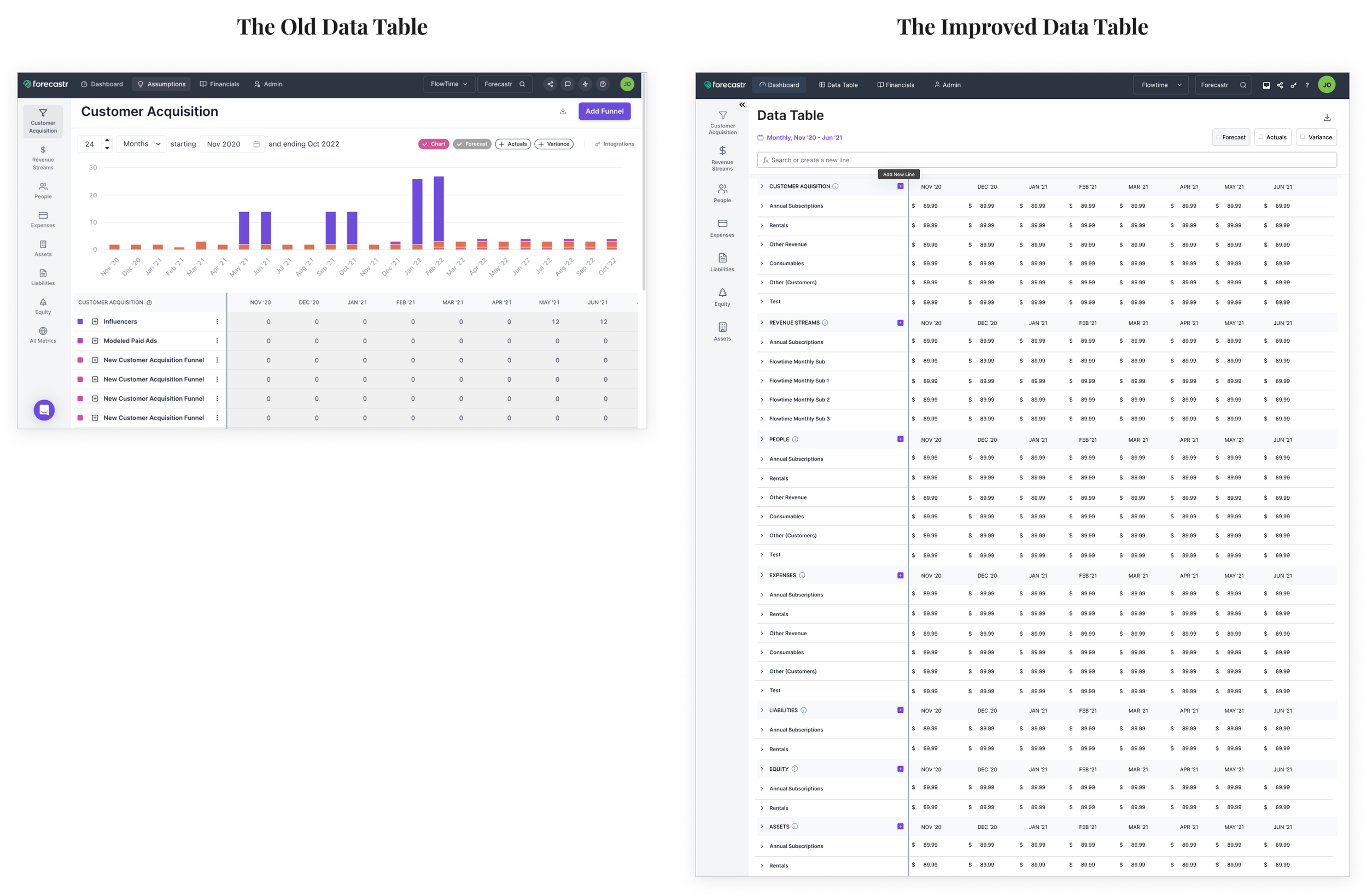
We need to design our data table similar to the ease of use and adaptability found in Excel, ensuring accessibility for all users without introducing a steep learning curve.
Problem Areas
-
Most users of the app do not have a finance background. The application used jargon like "assumptions" which had different meaning in various places in the app.
In addition, most of our users used Excel or Google Sheets, where their model is usually on a single sheet. But our data tables are held on separate tabs, called 'Assumptions.'
This structure has led to unnecessary clicks during model building, reducing efficiency.
-
Many of the UI elements were taking up unnecessarily space in the app like the date selector creating clutter.
-
The “Add Funnel” button leads to a drawer opening where users are able to create line items or metrics. This process is way too complex for simple tasks which is also reducing efficiency.

Improvements
-
Description text goes hereI removed the “Add Funnel” button and allowed all the functionalities to be done in the data table without the drawer.
Users will be able to create and search for a metric or line item and see exactly where it is in the data table just like Excel.
-
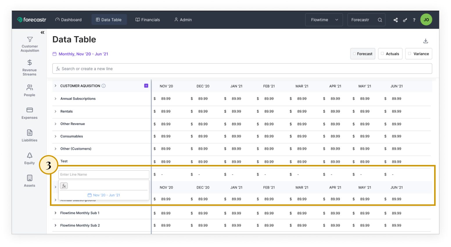
Users can also create a metric or line item through the plus button seen on each section.
-
Once users press the + button an entry line appears where they can create their line item.
-
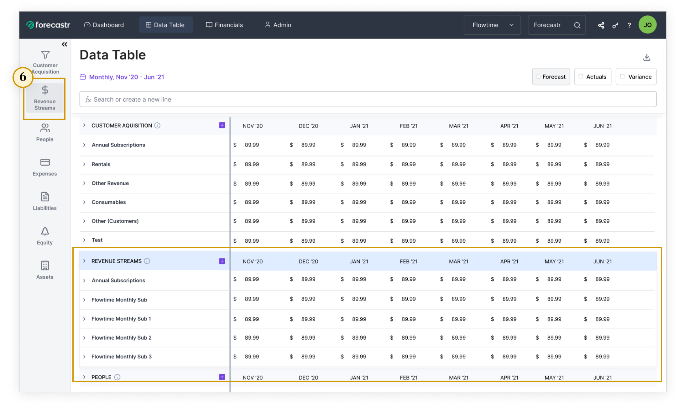
Instead of each tab being one page this entire page is now one sheet called “Data Table” instead of “Assumptions”. While also creating more white space by revising the date selector to a simple text.
This new sheet is now called “Data Table” instead of “Assumptions”.
While also creating more white space by revising the date selector to a simple text.
-
Admin users of this account can add permissions to their data table if they are sharing their account with others on the team.
-
For flexibility and personalization, users are able to drag and drag and collapse sections of the data table to organize it how they’d like.
-
For simplicity, the charts from the old data table were removed but users are still able to view charts on the data table by dragging a chart widget from the dashboard to the data table and it will be shown in the sidebar.



Designing the Dashboard
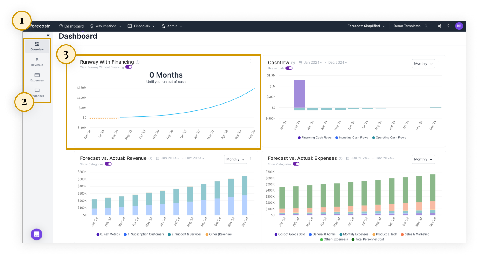
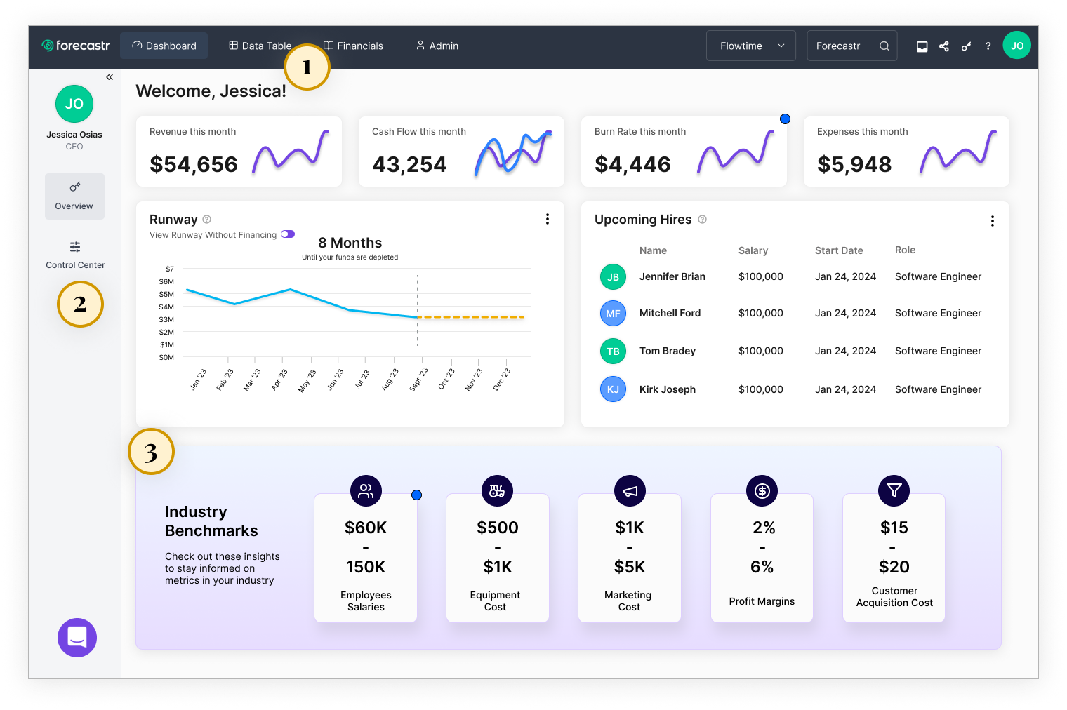
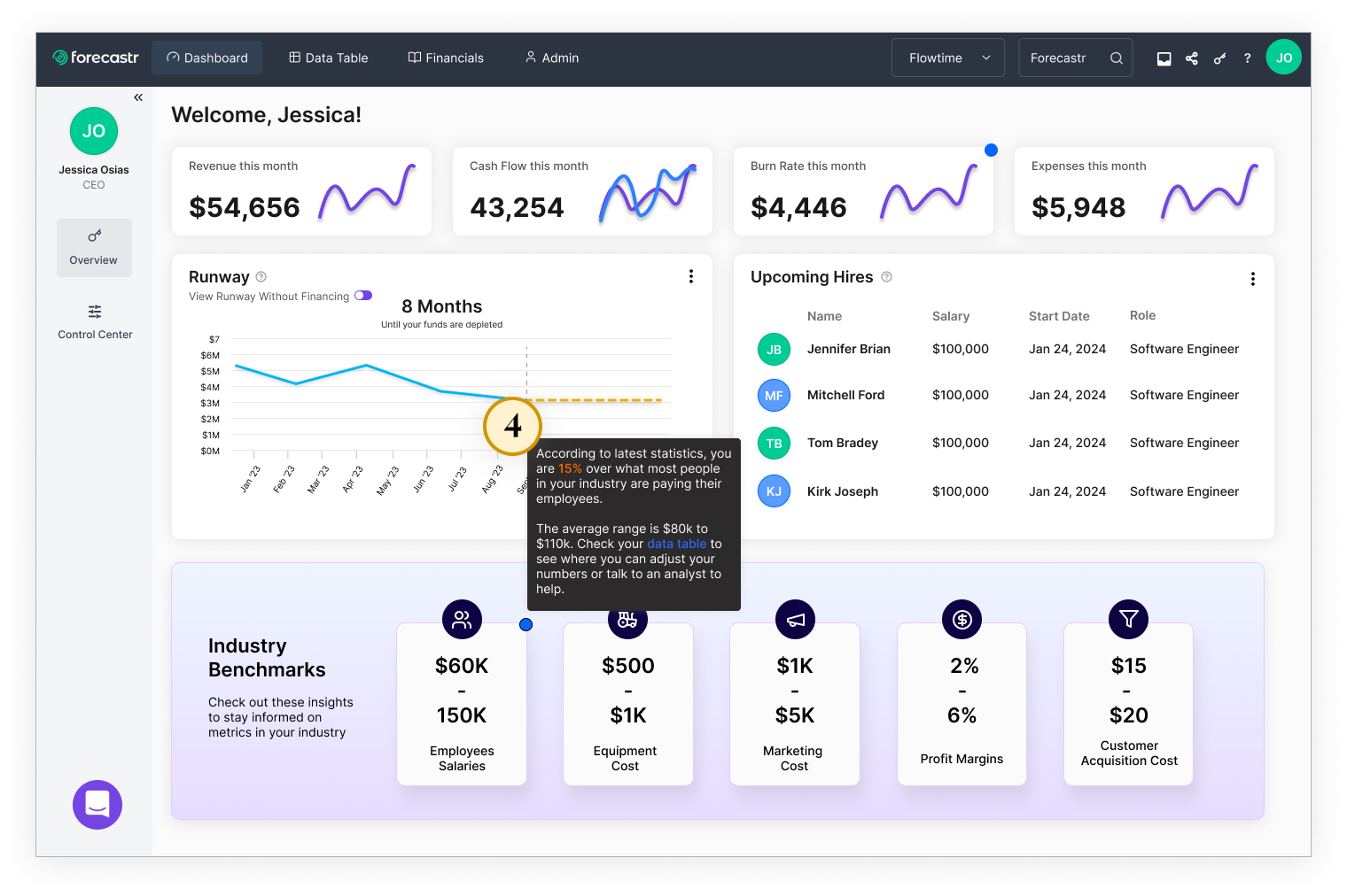
I aimed to enhance user engagement and customization. Users can now personalize their experience by rearranging widgets and accessing industry benchmarks, making the dashboard more visually appealing and user-friendly. Additionally, new notifications will keep users informed about their company's data compared to industry standards, fostering better decision-making and overall user satisfaction.

Problem Areas
-
Overall the dashboard doesn’t attract much engagement which can be due to the UI lacking visual appeal and no customization.
-
Since there’s no customization in the app, the sidebar menu options may not be how the user would like their widgets to be categorized.
-
The lack of flexibility in the dashboard doesn’t allow users to favorite widgets, move widgets, or drag and drop them into various section of the app to create a personalized experience.
Improvements
-
To improve the user’s personalized experience I added a “Welcome, [name], user favorited key metrics at the top, and the user has the ability to drag and move widgets for a flexible experience.
-
Instead of “Revenue, Expenses, and Finances” in the sidebar. The “Control Center” is where all the all dashboard widgets are held. On that tab, they can determine which widgets they’d like to have in their overview.
-
The industry benchmarks would help users see their industry insights to help them determine where they key metrics should be.
-
Since engagement is low on the dashboard, I incorporated notifications of industry standard metrics and if their company data falls within them. These messages will also be held in the message board found in the navigation.
The Bigger Picture & Key Takeaways
The overall theme of these improvements was to improve retention, engagement, and user satisfaction so users gain the value they were seeking to lift the financial burden of operating the finances of their small business. These changes collectively aimed to make the app more intuitive and valuable for users.
The biggest challenge was navigating the direction of the design while the executives were in the midst of figuring out how they wanted to proceed with the business. Once the company went from SaaS to SaaS and Services this altered who the main users were and my approach.
As these improvements are still being rolled out I’m certain each persona will find value in the improved usability.